Monday 20 October 2014

The Best Camera IN THE WORLD!

   Anyone who has looked at my work will have noticed my propensity for using photographs. Well, why wouldn't you? A picture is worth a thousand words, as they used to say, and a photo is a picture you don't have to make yourself. It's just there, waiting for you to hunt it down. But you've got to have a decent camera.
   So, what sort of camera is best? Well, if you want technical details don't come me. Professional photographers have to lug around a massive, heavy bag containing thousands of pounds worth of equipment, whilst worrying that the next technological breakthrough will render the whole lot obsolete overnight. The likes of you and I, however, need keep only one criteria in mind: The best camera in the world is THE ONE YOU'VE GOT WITH YOU ALL THE TIME.
   We're not going to tote around a heavy, bulky article every day on the off chance of getting a decent shot. No, we need a decent phone camera. So that's why I bought a Nokia Lumia 1020.
   As a phone, it's a dog. The Windows operating system is terrible. You're stuck with inferior versions of Android apps, like Skydrive instead of Dropbox. But I'll put up with it for the sake of the powerful camera.
   No amount of technology will help if it's in the cupboard at home. You have to strike a balance between effectiveness and portability.
   When adverts started appearing for the first phone cameras, starring some goon having his picture taken with a relatively tattoo – free David Beckham, I thought "What the hell are you going to use one of those for?" Now the camera is the most – used ancillary programme on any phone I have. So I make sure it's a decent one.  

PDP: Branding - not as fascinating as I thought.

   We visited Bridge Hall primary school, which is about to replace its WW2 era buildings with shiny new ones and need a new identity to go with it. The visit was fun, and informative - my partner is a primary school teacher, so now I have more idea of what she talks about. However, after staring at the list of requirements to be crammed, if possible, into the new logo, I had a revelation.

   I wasn't interested at all.

   There's a quote, supposedly attributable to an executive of the Coca – Cola company, which says:
    "If Coca-Cola were to lose all of its production-related assets in a disaster, the company would survive. By contrast, if all consumers were to have a sudden lapse of memory and forget everything related to Coca-Cola, the company would go out of business."

   This makes it seem quite sexy. Coke is, after all, just a soft drink. But, by some kind of magic, it has transcended the reality to become an icon, a dream, a symbol of freedom. At that level, yeah, it looks exciting.

    But at humdrum, everyday level, you are often 'gilding a turd'. You are tasked with making something inherently dull appear interesting. On top of that you are lumbered with mountains of nonsense that the client wants including in the design. And when you've done it - they don't like it. They say 'Can you just put this in? And take this out?' So you do. And they still don't like it.

   (Until you get a reputation, that is. Then you can say 'I know best. This is brilliant branding, the best you're gonna get. If you don't like it it's your funeral, but either way you owe me £££'s'.)

   I've tried to read many books on the subject, but I end up re – reading pages over and over again, vainly attempting to absorb the message. So it's not something I'm going to be concentrating on.
   

Sunday 19 October 2014

Hopes, Fears and Opportunities - Part 2

   I fear that I'm never going be any use at the Adobe stuff.

   When I say fear, I mean know. My mind cannot absorb the complexity of the procedures. I have wasted untold hours trying to accomplish some procedure or other that a more polished operator could deal with in minutes. It cripples my creativity. I hate it with real feeling.

   So I'm never going to be a graphic designer.

   There, I've said it. Three years of education wasted.

    Or is it?

   Well, maybe not. This course has opened my eyes to all manner of things that I knew, and cared, nothing about. Before I started this course I actively disliked the art world. The famous line "When I hear the word culture, I reach for my pistol", often misattributed to Hermann Goering, could have applied to me. If I'd had a pistol.

   But art, like Ebola, is extremely contagious.

   Another by – product of this course is the demolition of my conviction that I'm 'not very good with my hands'. Years of failed repairs to cars and bicycles, collapsed shelving, askew cupboards, blown fuses, leaking pipes and lost components had made me shy away from anything involving tools. But it would appear that I've changed over the years. I seem to have acquired analytical skills and tenacity from somewhere. Not to mention patience, of which I used to have precisely none.

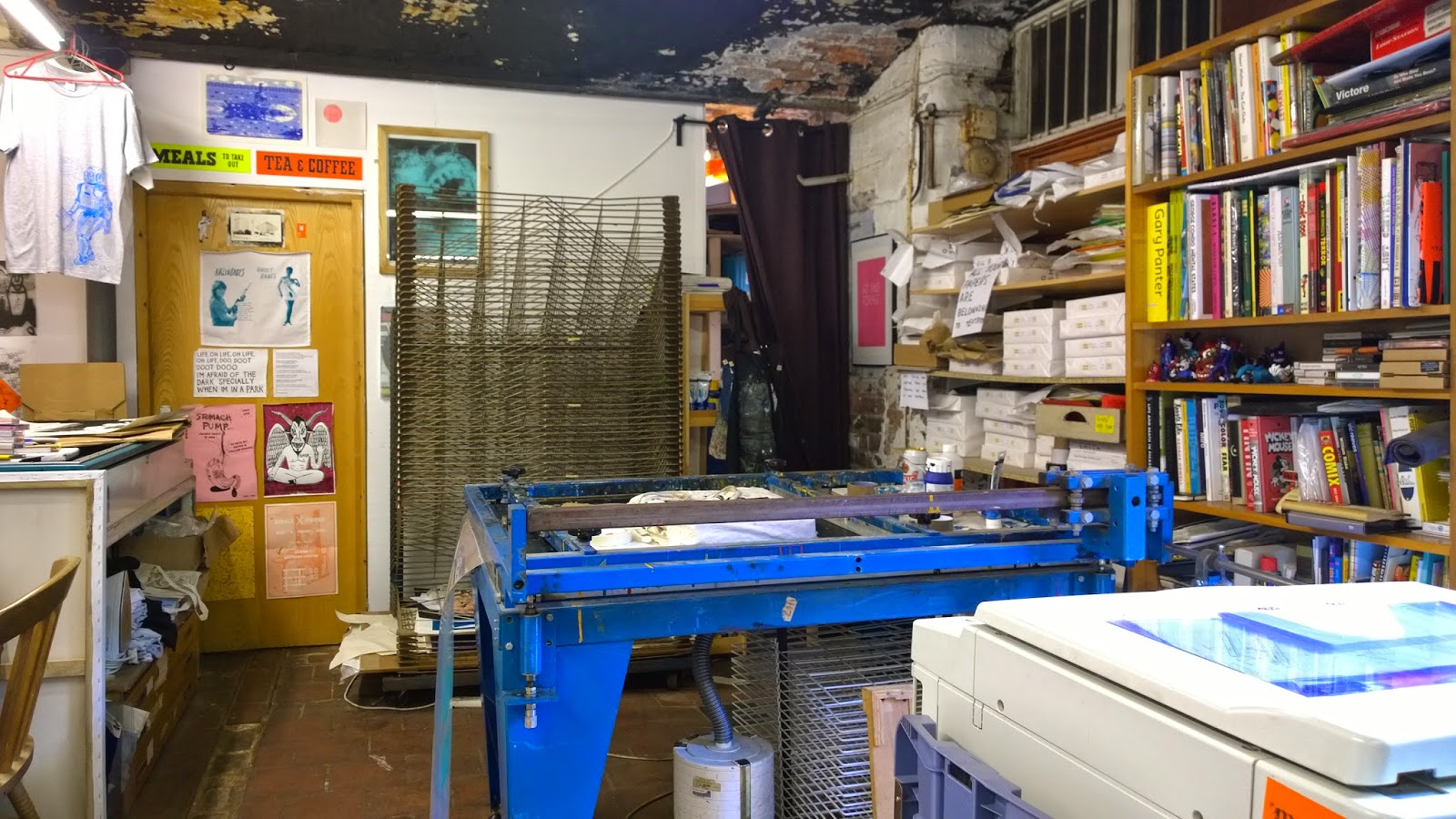
   So I'm convinced that my future lies in the 'Craft' world. Even more so after my visit to Textbook Studio, where thanks to Vicky and Chris the way was finally made clear. I do images. The image, to me, always comes first. The text is an afterthought. Though it's actually the typography I struggle with: the wording is straightforward enough.

   And as I'm far too old to take the usual career path, and have always assumed that I would be self – employed again rather than in a 'proper' job, it's not such a bad direction to take.

   I'd heard about Hotbed Press from Kiran, who does some work down there, and had contemplated stumping up for studio space when I lost access to the College's facilities next year. I asked Vicky about their facilities and she said they have the best anywhere around here. So I'm going to call on them over reading week and check them out. The downside of printing is that you need expensive, cumbersome and, in the case of presses, very heavy equipment, which wouldn't fit in the flat even if I could afford it. So becoming a member looks to be my first step on graduation. Looking forward to using an Albion press.

   So, image making it is. Someone else can do the type.


Portfolio Revue – Textbook Studio

   So, back to grim old Islington Mill for my first portfolio review. Mercifully, it was much warmer than last time we were here.


   Textbook Studio is my kind of place – full of old equipment in various states of repair, papers, books and bottles everywhere. It's the home of people who like making things, the exact opposite of a pristine Mac – monkey studio where the only old machinery is the bikes hanging from the wall.
   The visit went well. Their conclusions were:
   My images – great. Especially the linocuts. And the pinball table. (Apparently it's VERY rarely that students actually make stuff. They usually see just posters etc).
   My typography – shit.
   Well, no surprises there. I explained to Vicky and Chris that typography was a closed book to me. No amount of reading up on it has any effect - the information just slides off my mind like butter off a hot pan. But this doesn't matter. Because I have a future as an image maker.
   They gave me some straightforward 'Graphic Design' advice on the portfolio, and some other ideas too – maybe form the words 'Zines of Wonder' out of actual books, or make a movie of the pinball table. But the good advice was purely for me. Like bring actual linocuts and screenprints to reviews, for maximum tactile effect. To paraphrase Vicky, "I know you have to do this for the course, but FOR YOU, just fuck the text off and concentrate on the images".
   So that's what I'm going to do. I'll do enough typography and related stuff to pass the course, but the image will be my emphasis from now on. Vicky and Chris gave me a couple of people to contact - there's a bloke in Handforth with a Letterpress in his garage - and I'll be at the Manchester Print Fair on Saturday 25th October. See you there.


Tuesday 7 October 2014

PDP: Letterpress - the Future

   We had a lecture by Jim Williams today, he of 'Type Matters' fame. He graduated in 1982, when the tool of the time was Phototypesetting. This sounded horribly complicated, and subsequent research confirmed this - the advent of the digital age must have saved loads of time, though probably at the cost of loads of jobs. His salient point about it was, though, that he had to get it right first time, as corrections cost both time and money. Hence, you had to know about typography.

(Incidentally, the typesetting apprenticeship took seven years.)

   Now I've got his book. But I haven't read it. I've always found typography uninteresting. But when Jim started explaining the historical context of typographic terms, I succumbed, as usual, to the lure of the old.

   Letterpress, he says, is seeing a rise in popularity. Outfits like Apple are "Looking backwards to see forwards", or as I call it, strip-mining the past. But as previously discussed, I'm drawn to doing things the old-fashioned, hands-on way. Anything to get away from the wretched Adobe stuff that I have less than no affinity with. I regret missing out on the visit to the letterpress studio on last year's London trip, so I've never seen it actually done. And it's just another form of relief printing - another process I'm drawn to. It is taught as part of the Graphic Design course in some universities, though unfortunately not ours. And people are making a living out of it; Jim works with Blush Letterpress in North Wales, who print wedding invites etc.

   So, a valuable lecture. I've got another archaic technique to focus on, and some handy typography hints as well. Then again, they might have been in the book. Better read it, eh?

Saturday 4 October 2014

PDP – Lessons from Stefan Sagmeister

   A couple of weeks ago, if you'd said to me 'Stefan Sagmeister', I'd have thought 'razor blade nutjob'. That's the trouble when one piece of an artist's work is inevitably picked to represent them - like if you hear a Van Halen track it's usually 'Jump'. Everyone gets typecast.
   Then I read 'Things I have learned in my life so far' and 'Made you look'. Now I know better.
   He does MAD things. Like hanging out of a window of the Empire State Building so he could be filmed waving a sign, and almost being arrested as a jumper. Or making words out of tape wrapped round fences or trees. Or swimming in the Hudson river with letters on his back. Or using photos of Lou Reed at the point of orgasm to illustrate his album sleeve. He's not shy about getting his kit off and having his scrawny body become part of the message. either.
   In short, he's a performer.
   I have no desire, never mind ability, to stare at a Mac for days at a time. It's not healthy, for one thing - the screen gives me migraines, and there's nothing worse for your health than sitting at a desk shoving crap into your gob for twelve hours at a stretch. But that's the lot of most Mac monkeys.
   Sagmeister has shown me that there's a market for designers who DO stuff, who make mad things out in the open. That's more the sort of life I want to lead than being chained to a desk all day.
   Before I started this course, I thought I was crap at the hands-on stuff. But when I was photographing the pinball table, and I was fiddling with the mirrors to line up the laser, Graham Holt said "Were you an engineer in a former life?" So, maybe, I'm not crap at it after all.