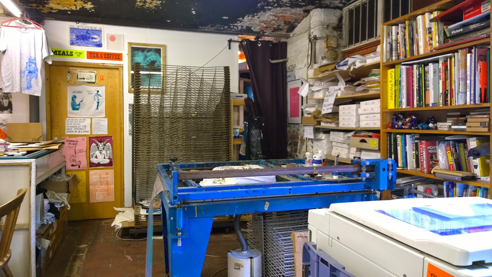
So, back to grim old Islington Mill for my first portfolio review. Mercifully, it was much warmer than last time we were here.
Textbook Studio is my kind of place – full of old equipment in various states of repair, papers, books and bottles everywhere. It's the home of people who like making things, the exact opposite of a pristine Mac – monkey studio where the only old machinery is the bikes hanging from the wall.
The visit went well. Their conclusions were:
My images – great. Especially the linocuts. And the pinball table. (Apparently it's VERY rarely that students actually make stuff. They usually see just posters etc).
My typography – shit.
Well, no surprises there. I explained to Vicky and Chris that typography was a closed book to me. No amount of reading up on it has any effect - the information just slides off my mind like butter off a hot pan. But this doesn't matter. Because I have a future as an image maker.
They gave me some straightforward 'Graphic Design' advice on the portfolio, and some other ideas too – maybe form the words 'Zines of Wonder' out of actual books, or make a movie of the pinball table. But the good advice was purely for me. Like bring actual linocuts and screenprints to reviews, for maximum tactile effect. To paraphrase Vicky, "I know you have to do this for the course, but FOR YOU, just fuck the text off and concentrate on the images".
So that's what I'm going to do. I'll do enough typography and related stuff to pass the course, but the image will be my emphasis from now on. Vicky and Chris gave me a couple of people to contact - there's a bloke in Handforth with a Letterpress in his garage - and I'll be at the Manchester Print Fair on Saturday 25th October. See you there.


No comments:
Post a Comment