If you've looked at my website (http://www.pjsutton.co.uk/home.html) you'll notice that there's just my artwork on display. There's no blog.
Now, we're told we should have blogs - to 'bond with people who like their work', to quote The Artist's Guide to Selling Work by Annabelle Ruston. All well and good in theory. But...
What if you can't think of anything to write?
I'm not a natural blogger. I called this blog 'Open a Vein' after the quote (often attributed to Hemingway) that goes "There's nothing to writing. All you do is sit down at a typewriter and open a vein". In other words, words don't come easy. And this particular blog is about all kinds of stuff, whereas a printmaker's blog, you would expect, would be purely concerned with printmaking. Not many potential customers, the people a printmaker is trying to attract, are going to care about his opinions on world politics or the ridiculously high price of lamb.
And so, if the blog is purely about techniques and processes, it's going to appeal, not to customers, but to other printmakers! Your rivals!
I checked out a few of my favourite printmakers' sites to see what they were doing:
Nick Morley, AKA Linocutboy - Ten blog posts in the last year. A mix of tips, news about work done and courses available. http://linocutboy.com/blog/
Mark Andrew Webber - Four posts since May, but it's a new site. He says "I also hope to be updating this blog on a more regular basis, to include work in progress pictures, and general thoughts", so looks like the last blog wasn't too regular. http://markandrewwebber.com/?page_id=2331
Gail Brodholt - No blog. http://www.gailbrodholt.com/
Paul Catherall - No blog. http://www.paulcatherall.com/
Kevin Holdaway - No blog. http://www.kevintraditionalprintmaker.co.uk/
Angie Lewin - Nine posts in the last year. News on her and other printmakers. No tips. http://www.angielewin.co.uk/blogs/news
So some do, some don't. Perhaps I'm just arguing about the definition of the term 'blog'. In my mind a blog is a constant stream of blather, and it's beyond me how people can come up with all the stuff they do. I suppose its not the doing that bothers me, but the frequency and quality. I can do quality. Quantity I'll leave to others.
Wednesday, 19 August 2015

Distraction Tactics
If I had a pound for every time some idiot has made a comment to me like 'Cheer up, it might never happen"....
My default expression is, I gather, quite surly. Off-putting, even. I've got used to it over the years, but it occurs to me that it might be something of a disadvantage when trying to sell work at print fairs. After all, when in second year we had to show our work to the third year and absorb their critique, NO-ONE approached me. I sat in splendid isolation, avoided by all.
So, should I practice being more personable by smiling in the mirror?
 Maybe not. so what am I going to do?
Then I remembered something that had always puzzled me. Inevitably at print fairs there's one person who is working at his stall, cutting away at a lino block. Why, I wondered, are they doing that now? How do they concentrate? But now it occurs to me that they too might not want to scare the customers away.
So that's what I intend to do. And of course potential buyers can see the skills and effort involved in making the work (and justifying the price). Result.
My default expression is, I gather, quite surly. Off-putting, even. I've got used to it over the years, but it occurs to me that it might be something of a disadvantage when trying to sell work at print fairs. After all, when in second year we had to show our work to the third year and absorb their critique, NO-ONE approached me. I sat in splendid isolation, avoided by all.
So, should I practice being more personable by smiling in the mirror?

Then I remembered something that had always puzzled me. Inevitably at print fairs there's one person who is working at his stall, cutting away at a lino block. Why, I wondered, are they doing that now? How do they concentrate? But now it occurs to me that they too might not want to scare the customers away.
So that's what I intend to do. And of course potential buyers can see the skills and effort involved in making the work (and justifying the price). Result.
Tuesday, 18 August 2015
Plakatstil - Poster Style, and how to do it.
Of all the art forms I've been exposed to over the last three years, this is the one I want to emulate the most.
'It's only posters, not real art' I hear you say. well, tell that to the 'real' artists who created stuff like this:
 Poster for the London, Midland & Scottish Railway, by Norman Wilkinson.

'HMS Courageous in Dry Dock' by Charles Pears.
 'Cowes Week' by Kenneth Shoesmith
 'Petergate, York' by Fred Taylor
I liked this stuff before I had a vested interest; I like it even more now I'm into printmaking. Because this style adapts itself very well to printing. Who would have guessed that of something called 'Poster Style'?
This is how I transform a photo into plakatstil:
 Find a suitable image, load into Adobe Illustrator, and live trace it.
 This is six colours, though I could use as many colours as I saw fit.
Then hit expand. This vectors the separate colour layers.
Then select all layers and click window-pathfinder-trim. This 'cuts out' the separate colours.
Next click on a single area of one of the colours, then click select-same-fill colour. this will select every bit of that particular colour.
In the layers panel you will now see a square of colour to the right of the layers tab. Create a new layer, then drag the coloured square into the new layer tab. This will move all the areas of that colour into the new layer. Repeat with the rest of the colours.
You now have the picture dissected into separate layers, which can be transferred to screens of lino blocks for printing.
So far the images I've created using this process have been pretty good. I'll carry on experimenting with it to see how far I can go.
'It's only posters, not real art' I hear you say. well, tell that to the 'real' artists who created stuff like this:


I liked this stuff before I had a vested interest; I like it even more now I'm into printmaking. Because this style adapts itself very well to printing. Who would have guessed that of something called 'Poster Style'?
This is how I transform a photo into plakatstil:


Then hit expand. This vectors the separate colour layers.
Then select all layers and click window-pathfinder-trim. This 'cuts out' the separate colours.
Next click on a single area of one of the colours, then click select-same-fill colour. this will select every bit of that particular colour.
In the layers panel you will now see a square of colour to the right of the layers tab. Create a new layer, then drag the coloured square into the new layer tab. This will move all the areas of that colour into the new layer. Repeat with the rest of the colours.
You now have the picture dissected into separate layers, which can be transferred to screens of lino blocks for printing.
So far the images I've created using this process have been pretty good. I'll carry on experimenting with it to see how far I can go.
Saturday, 15 August 2015
Hopes, Fears and Opportunities - Part 3
I hope I'll never have to work for anyone ever again. And I fear that I might have to.
If you've looked at the previous two posts in this series, you'll have seen my gradual change of career direction over time. In the first post I was thinking I might possibly end up working in a studio, albeit in some other capacity than that of Mac-monkey; already I knew that was not for me. By the second post I had decided, after sage advice from Vicky and Chris at Textbook Studio (and later confirmation from Peter Holden), that graphic design was out of the question. I was only interested in the image - the words were someone else's problem. And the images I liked making were prints.
The days that most changed my direction came in first year. The first was when I volunteered to help Kiran with the screenprinting of the tablecloth to be used at recruitment fairs. I had no idea what screenprinting was, but I found the process fascinating and rewarding.

The second came when Lucy trooped us along to Jacqui Darlington's domain to sample the delights of printing. At that time I knew so little that I was surprised to find that Linocut actually involved lino, like you used to find on bathroom floors. Bu the prospect of cutting into something appealed to me, so I gave it a go; and from the first cut I was hooked. I am enraged to think that, thanks to the college's penny-pinching (except when it comes to management salaries), both these departments have been gutted and new students won't get the levels of inspiration and support that I did.
I've never liked dancing to someone else's tune. Especially if that someone else is an idiot. So the prospect of life as an independent artist/printmaker is very appealing. The act of creating something of my own choosing is deeply satisfying, and recent history tells me that people like what I produce. After that it's a matter of marketing and selling the resultant prints, which is admittedly a bit more like 'work'; but overall a lot more attractive than staring at a computer all day, worrying over whether I've chosen the right font.
Of course, I realise that it may not be that simple, and that I may have to get a job. But I'll aim for something relevant to my field and skills, such as screenprinting, rather than just take any old nonsense. God knows I made enough bad career and life choices over the last forty years - well, until I signed up at the college and my life changed - and I'm damned if I'm going to make any more.
The path is clear from now on.
Make prints. Sell prints. Repeat.
Saturday, 8 August 2015
Tooling Up
To do printmaking the way I like to, you need a lot of stuff.
Some people are happy transferring the ink from lino block to paper by rubbing with a baren or a wooden spoon. But I've never been happy with the results, and it takes an age. So I'm going to need a press.
There are various tabletop presses on the market, but all but the very small ones are of the etching press type, where the block is dragged under a roller. I've used the one at College, and I'm not keen on that either. So, shall I buy an Albion or Columbia press?
There are disadvantages. Not least the price.
 This is for a brand new one. So how about second hand?
Before the curse of Ebay, which enabled everyone to find out the value of everything, these things were going for scrap metal prices. Not any more. The only one I could find on Ebay today was this one...
 Yours for £6500, guv.
And then there's the weight issue.
 Never going to get that up the stairs. So, what to do?
Join Hot Bed Press, that's what.
Based in an old factory near Islington Mill in Salford, Hot Bed Press have three relief presses - two Albions and a Columbia, five etching presses and seven screen beds, along with tech support on tap. Anyone can join and gain access to this wealth of equipment and knowledge. They run frequent courses - I joined a while ago and attended one on reduction linocut led by the brilliant Kevin Holdaway. I learned a huge amount over that weekend, producing this in the process.
 So if you like getting your hands inky, but lack the money and/or space to tool yourself up, sign up now. It's well worth it.
Check them out HERE
Some people are happy transferring the ink from lino block to paper by rubbing with a baren or a wooden spoon. But I've never been happy with the results, and it takes an age. So I'm going to need a press.
There are various tabletop presses on the market, but all but the very small ones are of the etching press type, where the block is dragged under a roller. I've used the one at College, and I'm not keen on that either. So, shall I buy an Albion or Columbia press?
There are disadvantages. Not least the price.

Before the curse of Ebay, which enabled everyone to find out the value of everything, these things were going for scrap metal prices. Not any more. The only one I could find on Ebay today was this one...

And then there's the weight issue.

Join Hot Bed Press, that's what.
Based in an old factory near Islington Mill in Salford, Hot Bed Press have three relief presses - two Albions and a Columbia, five etching presses and seven screen beds, along with tech support on tap. Anyone can join and gain access to this wealth of equipment and knowledge. They run frequent courses - I joined a while ago and attended one on reduction linocut led by the brilliant Kevin Holdaway. I learned a huge amount over that weekend, producing this in the process.

Check them out HERE
Bust a deal, face the wheel.
After choosing 'Trees' to be the subject of my 'Initiate' brief, I remembered speaking to Beth Knowles at the Manchester Print Fair. She's a Manchester Councillor and runs a charity called 'A New Leaf', whose aim is to increase the greenery in central Manchester by planting trees. I prefer doing a live brief to a plain old academic exercise, so I decided to offer my services.
I met Beth at her office in January to discuss the selling of my work to raise funds. She liked what I'd done so far, and off I went to continue with the brief. I promiswed her product for the next print fair in April
Fast forward to April, and due to the string of catastrophes I'd been subject to I hadn't got anywhere near as much product as I intended. But I marched off to the People's History Museum, venue for the print fair, with an armload of my best stuff.
Beth wasn't there - she was stuck on a train between London and here, so I dropped my stuff on the desk of Alessandra Mostyn, Beth's oppo. She hadn't a clue who I was, but with some bemusement said she'd lay out the prints for anyone to buy.
 Plenty looked, but no-one bought as far as I know. And that, it would appear, was that.
I haven't contacted them since - no time, as the disasters haven't abated - and they haven't contacted me. So with the finishing post looming, and with having to work for a living only weeks away, it's tempting to write it off. After all, who wants to work for free?
But I won't.
Why?
Because it isn't a good precedent to set.
I said I'd do it. It's public knowledge that I made this offer. I don't want to get a reputation for unreliability. I don't like people breaking their word to me, so I don't do it to them.
In the film Mad Max 3 the post apocalyptic market town run by Tina Turner had a policy to ensure straight dealing - Bust a deal, face the wheel. They spun a wheel to decide the grisly fate of the deal-breaker, with options like death or amputation.
Sounds fair enough to me.
I met Beth at her office in January to discuss the selling of my work to raise funds. She liked what I'd done so far, and off I went to continue with the brief. I promiswed her product for the next print fair in April
Fast forward to April, and due to the string of catastrophes I'd been subject to I hadn't got anywhere near as much product as I intended. But I marched off to the People's History Museum, venue for the print fair, with an armload of my best stuff.
Beth wasn't there - she was stuck on a train between London and here, so I dropped my stuff on the desk of Alessandra Mostyn, Beth's oppo. She hadn't a clue who I was, but with some bemusement said she'd lay out the prints for anyone to buy.

I haven't contacted them since - no time, as the disasters haven't abated - and they haven't contacted me. So with the finishing post looming, and with having to work for a living only weeks away, it's tempting to write it off. After all, who wants to work for free?
But I won't.
Why?
Because it isn't a good precedent to set.
I said I'd do it. It's public knowledge that I made this offer. I don't want to get a reputation for unreliability. I don't like people breaking their word to me, so I don't do it to them.
In the film Mad Max 3 the post apocalyptic market town run by Tina Turner had a policy to ensure straight dealing - Bust a deal, face the wheel. They spun a wheel to decide the grisly fate of the deal-breaker, with options like death or amputation.
Sounds fair enough to me.
Wednesday, 5 August 2015
Proofreading's first rule - make the words REALLY BIG
The book I created for my research project came back from Blurb the other day. And it looks great.

But, but, but...
There are mistakes. Hideous blunders. SPELLING MISTAKES, for God's sake. Or at least typos.
Now I'm a grammar nazi, up to a point. I don't know enough about it to get things spot on, but I've read enough to have a good idea what looks wrong and what looks right.
Some of the lines are single spaced, when I wanted them all double spaced. Sometimes these two options are on adjacent pages! And I didn't spot it.
 I figured out that it was the fault of the smaller image on the Mac screen. The defects went unnoticed despite the horrendous length of time I spent staring at the screen. But they screamed out at me when I saw them actual size.
Lucy once gave me a great piece of advice: test print EVERYTHING before the final edition. But the college was closed, every time I came in the Mac suite was bolted and barred, and anyway it would have cost a tenner...so I didn't. But I wish I had.

But, but, but...
There are mistakes. Hideous blunders. SPELLING MISTAKES, for God's sake. Or at least typos.
Now I'm a grammar nazi, up to a point. I don't know enough about it to get things spot on, but I've read enough to have a good idea what looks wrong and what looks right.
Some of the lines are single spaced, when I wanted them all double spaced. Sometimes these two options are on adjacent pages! And I didn't spot it.

Lucy once gave me a great piece of advice: test print EVERYTHING before the final edition. But the college was closed, every time I came in the Mac suite was bolted and barred, and anyway it would have cost a tenner...so I didn't. But I wish I had.
Thursday, 9 July 2015
Portfolio Revue – Peter Holden
I'm an Illustrator. Apparently.
My visit to Holden and Sons confirmed what I heard at Textbook, and what I already suspected: My future lies in the world of images. Peter expressed surprise that my tutors hadn't transferted me to the Illustration course whether I wanted it or not.
Holden and Sons has expanded since our visit in the spring, so now there were roomy couches for me to sprawl on while Peter made the coffee. The new room isn't yet cluttered with old machinery, but if the other room is anything to go by I'll bet it soon will be.
Peter liked my images a lot, especially the linocuts. He reckons I've really got something there. He also liked a style of thinking that can jump from a Russian doll to a Dalek. What he doesn't like are my typographic skills, or their absence.
The 'leaves' print for the Growing Together project drew fire for the way the type has been highlighted to stand out from the 'busy' background.

I explained that I came up with the idea, created the image, and only then thought about how to merge in the type.
We fell to discussing an interest in typography, or a lack of it in my case. Peter's interest was sparked by this:
 The 1960's TV series 'The Avengers', or rather its opening sequence. I explained that I'd tried to become enthusiastic about typography, but it just didn't 'take', and he agreed that you can't command yourself to be interested in something. You either are, or you aren't.
Adobe reared its ugly head when Peter said that today's studios expect full–spectrum skills from their potential recruits. I replied that I was never going to be better than average in that department, but that I didn't see myself touting for a studio position – who's going to take on a 55 year old? He then revealed that he knew perfectly good, experienced designers who couldn't get work as they were competing with the whole world now. Another suspicion confirmed – unless your skill is unique, someone on the other side of the world will undercut you. So my hopes of sitting in a room with bikes hanging off the wall, staring at a Mac screen, motionless but for my cursor hand, for eleven hours a day have been dashed.
So, self-employed printmaker it is. At least I'll be doing something I enjoy. How many workers can say that?
My visit to Holden and Sons confirmed what I heard at Textbook, and what I already suspected: My future lies in the world of images. Peter expressed surprise that my tutors hadn't transferted me to the Illustration course whether I wanted it or not.
Holden and Sons has expanded since our visit in the spring, so now there were roomy couches for me to sprawl on while Peter made the coffee. The new room isn't yet cluttered with old machinery, but if the other room is anything to go by I'll bet it soon will be.
Peter liked my images a lot, especially the linocuts. He reckons I've really got something there. He also liked a style of thinking that can jump from a Russian doll to a Dalek. What he doesn't like are my typographic skills, or their absence.
The 'leaves' print for the Growing Together project drew fire for the way the type has been highlighted to stand out from the 'busy' background.
I explained that I came up with the idea, created the image, and only then thought about how to merge in the type.
We fell to discussing an interest in typography, or a lack of it in my case. Peter's interest was sparked by this:
Adobe reared its ugly head when Peter said that today's studios expect full–spectrum skills from their potential recruits. I replied that I was never going to be better than average in that department, but that I didn't see myself touting for a studio position – who's going to take on a 55 year old? He then revealed that he knew perfectly good, experienced designers who couldn't get work as they were competing with the whole world now. Another suspicion confirmed – unless your skill is unique, someone on the other side of the world will undercut you. So my hopes of sitting in a room with bikes hanging off the wall, staring at a Mac screen, motionless but for my cursor hand, for eleven hours a day have been dashed.
So, self-employed printmaker it is. At least I'll be doing something I enjoy. How many workers can say that?
Monday, 20 October 2014
The Best Camera IN THE WORLD!
Anyone who has looked at my work will have noticed my propensity for using photographs. Well, why wouldn't you? A picture is worth a thousand words, as they used to say, and a photo is a picture you don't have to make yourself. It's just there, waiting for you to hunt it down. But you've got to have a decent camera.
So, what sort of camera is best? Well, if you want technical details don't come me. Professional photographers have to lug around a massive, heavy bag containing thousands of pounds worth of equipment, whilst worrying that the next technological breakthrough will render the whole lot obsolete overnight. The likes of you and I, however, need keep only one criteria in mind: The best camera in the world is THE ONE YOU'VE GOT WITH YOU ALL THE TIME.
We're not going to tote around a heavy, bulky article every day on the off chance of getting a decent shot. No, we need a decent phone camera. So that's why I bought a Nokia Lumia 1020.
As a phone, it's a dog. The Windows operating system is terrible. You're stuck with inferior versions of Android apps, like Skydrive instead of Dropbox. But I'll put up with it for the sake of the powerful camera.
 No amount of technology will help if it's in the cupboard at home. You have to strike a balance between effectiveness and portability.
When adverts started appearing for the first phone cameras, starring some goon having his picture taken with a relatively tattoo – free David Beckham, I thought "What the hell are you going to use one of those for?" Now the camera is the most – used ancillary programme on any phone I have. So I make sure it's a decent one.
So, what sort of camera is best? Well, if you want technical details don't come me. Professional photographers have to lug around a massive, heavy bag containing thousands of pounds worth of equipment, whilst worrying that the next technological breakthrough will render the whole lot obsolete overnight. The likes of you and I, however, need keep only one criteria in mind: The best camera in the world is THE ONE YOU'VE GOT WITH YOU ALL THE TIME.
We're not going to tote around a heavy, bulky article every day on the off chance of getting a decent shot. No, we need a decent phone camera. So that's why I bought a Nokia Lumia 1020.
As a phone, it's a dog. The Windows operating system is terrible. You're stuck with inferior versions of Android apps, like Skydrive instead of Dropbox. But I'll put up with it for the sake of the powerful camera.
When adverts started appearing for the first phone cameras, starring some goon having his picture taken with a relatively tattoo – free David Beckham, I thought "What the hell are you going to use one of those for?" Now the camera is the most – used ancillary programme on any phone I have. So I make sure it's a decent one.
PDP: Branding - not as fascinating as I thought.
We visited Bridge Hall primary school, which is about to replace its WW2 era buildings with shiny new ones and need a new identity to go with it. The visit was fun, and informative - my partner is a primary school teacher, so now I have more idea of what she talks about. However, after staring at the list of requirements to be crammed, if possible, into the new logo, I had a revelation.
I wasn't interested at all.
There's a quote, supposedly attributable to an executive of the Coca – Cola company, which says:
"If Coca-Cola were to lose all of its production-related assets in a disaster, the company would survive. By contrast, if all consumers were to have a sudden lapse of memory and forget everything related to Coca-Cola, the company would go out of business."
This makes it seem quite sexy. Coke is, after all, just a soft drink. But, by some kind of magic, it has transcended the reality to become an icon, a dream, a symbol of freedom. At that level, yeah, it looks exciting.
But at humdrum, everyday level, you are often 'gilding a turd'. You are tasked with making something inherently dull appear interesting. On top of that you are lumbered with mountains of nonsense that the client wants including in the design. And when you've done it - they don't like it. They say 'Can you just put this in? And take this out?' So you do. And they still don't like it.
(Until you get a reputation, that is. Then you can say 'I know best. This is brilliant branding, the best you're gonna get. If you don't like it it's your funeral, but either way you owe me £££'s'.)
I've tried to read many books on the subject, but I end up re – reading pages over and over again, vainly attempting to absorb the message. So it's not something I'm going to be concentrating on.
I wasn't interested at all.
There's a quote, supposedly attributable to an executive of the Coca – Cola company, which says:
"If Coca-Cola were to lose all of its production-related assets in a disaster, the company would survive. By contrast, if all consumers were to have a sudden lapse of memory and forget everything related to Coca-Cola, the company would go out of business."
This makes it seem quite sexy. Coke is, after all, just a soft drink. But, by some kind of magic, it has transcended the reality to become an icon, a dream, a symbol of freedom. At that level, yeah, it looks exciting.
But at humdrum, everyday level, you are often 'gilding a turd'. You are tasked with making something inherently dull appear interesting. On top of that you are lumbered with mountains of nonsense that the client wants including in the design. And when you've done it - they don't like it. They say 'Can you just put this in? And take this out?' So you do. And they still don't like it.
(Until you get a reputation, that is. Then you can say 'I know best. This is brilliant branding, the best you're gonna get. If you don't like it it's your funeral, but either way you owe me £££'s'.)
I've tried to read many books on the subject, but I end up re – reading pages over and over again, vainly attempting to absorb the message. So it's not something I'm going to be concentrating on.
Sunday, 19 October 2014
Hopes, Fears and Opportunities - Part 2
I fear that I'm never going be any use at the Adobe stuff.
When I say fear, I mean know. My mind cannot absorb the complexity of the procedures. I have wasted untold hours trying to accomplish some procedure or other that a more polished operator could deal with in minutes. It cripples my creativity. I hate it with real feeling.
So I'm never going to be a graphic designer.
There, I've said it. Three years of education wasted.
Or is it?
Well, maybe not. This course has opened my eyes to all manner of things that I knew, and cared, nothing about. Before I started this course I actively disliked the art world. The famous line "When I hear the word culture, I reach for my pistol", often misattributed to Hermann Goering, could have applied to me. If I'd had a pistol.
But art, like Ebola, is extremely contagious.
Another by – product of this course is the demolition of my conviction that I'm 'not very good with my hands'. Years of failed repairs to cars and bicycles, collapsed shelving, askew cupboards, blown fuses, leaking pipes and lost components had made me shy away from anything involving tools. But it would appear that I've changed over the years. I seem to have acquired analytical skills and tenacity from somewhere. Not to mention patience, of which I used to have precisely none.
So I'm convinced that my future lies in the 'Craft' world. Even more so after my visit to Textbook Studio, where thanks to Vicky and Chris the way was finally made clear. I do images. The image, to me, always comes first. The text is an afterthought. Though it's actually the typography I struggle with: the wording is straightforward enough.
And as I'm far too old to take the usual career path, and have always assumed that I would be self – employed again rather than in a 'proper' job, it's not such a bad direction to take.
I'd heard about Hotbed Press from Kiran, who does some work down there, and had contemplated stumping up for studio space when I lost access to the College's facilities next year. I asked Vicky about their facilities and she said they have the best anywhere around here. So I'm going to call on them over reading week and check them out. The downside of printing is that you need expensive, cumbersome and, in the case of presses, very heavy equipment, which wouldn't fit in the flat even if I could afford it. So becoming a member looks to be my first step on graduation. Looking forward to using an Albion press.
So, image making it is. Someone else can do the type.
When I say fear, I mean know. My mind cannot absorb the complexity of the procedures. I have wasted untold hours trying to accomplish some procedure or other that a more polished operator could deal with in minutes. It cripples my creativity. I hate it with real feeling.
So I'm never going to be a graphic designer.
There, I've said it. Three years of education wasted.
Or is it?
Well, maybe not. This course has opened my eyes to all manner of things that I knew, and cared, nothing about. Before I started this course I actively disliked the art world. The famous line "When I hear the word culture, I reach for my pistol", often misattributed to Hermann Goering, could have applied to me. If I'd had a pistol.
But art, like Ebola, is extremely contagious.
Another by – product of this course is the demolition of my conviction that I'm 'not very good with my hands'. Years of failed repairs to cars and bicycles, collapsed shelving, askew cupboards, blown fuses, leaking pipes and lost components had made me shy away from anything involving tools. But it would appear that I've changed over the years. I seem to have acquired analytical skills and tenacity from somewhere. Not to mention patience, of which I used to have precisely none.
So I'm convinced that my future lies in the 'Craft' world. Even more so after my visit to Textbook Studio, where thanks to Vicky and Chris the way was finally made clear. I do images. The image, to me, always comes first. The text is an afterthought. Though it's actually the typography I struggle with: the wording is straightforward enough.
And as I'm far too old to take the usual career path, and have always assumed that I would be self – employed again rather than in a 'proper' job, it's not such a bad direction to take.
I'd heard about Hotbed Press from Kiran, who does some work down there, and had contemplated stumping up for studio space when I lost access to the College's facilities next year. I asked Vicky about their facilities and she said they have the best anywhere around here. So I'm going to call on them over reading week and check them out. The downside of printing is that you need expensive, cumbersome and, in the case of presses, very heavy equipment, which wouldn't fit in the flat even if I could afford it. So becoming a member looks to be my first step on graduation. Looking forward to using an Albion press.
So, image making it is. Someone else can do the type.
Portfolio Revue – Textbook Studio
So, back to grim old Islington Mill for my first portfolio review. Mercifully, it was much warmer than last time we were here.


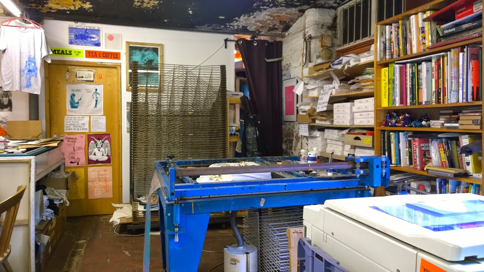
Textbook Studio is my kind of place – full of old equipment in various states of repair, papers, books and bottles everywhere. It's the home of people who like making things, the exact opposite of a pristine Mac – monkey studio where the only old machinery is the bikes hanging from the wall.
The visit went well. Their conclusions were:
My images – great. Especially the linocuts. And the pinball table. (Apparently it's VERY rarely that students actually make stuff. They usually see just posters etc).
My typography – shit.
Well, no surprises there. I explained to Vicky and Chris that typography was a closed book to me. No amount of reading up on it has any effect - the information just slides off my mind like butter off a hot pan. But this doesn't matter. Because I have a future as an image maker.
They gave me some straightforward 'Graphic Design' advice on the portfolio, and some other ideas too – maybe form the words 'Zines of Wonder' out of actual books, or make a movie of the pinball table. But the good advice was purely for me. Like bring actual linocuts and screenprints to reviews, for maximum tactile effect. To paraphrase Vicky, "I know you have to do this for the course, but FOR YOU, just fuck the text off and concentrate on the images".
So that's what I'm going to do. I'll do enough typography and related stuff to pass the course, but the image will be my emphasis from now on. Vicky and Chris gave me a couple of people to contact - there's a bloke in Handforth with a Letterpress in his garage - and I'll be at the Manchester Print Fair on Saturday 25th October. See you there.
Textbook Studio is my kind of place – full of old equipment in various states of repair, papers, books and bottles everywhere. It's the home of people who like making things, the exact opposite of a pristine Mac – monkey studio where the only old machinery is the bikes hanging from the wall.
The visit went well. Their conclusions were:
My images – great. Especially the linocuts. And the pinball table. (Apparently it's VERY rarely that students actually make stuff. They usually see just posters etc).
My typography – shit.
Well, no surprises there. I explained to Vicky and Chris that typography was a closed book to me. No amount of reading up on it has any effect - the information just slides off my mind like butter off a hot pan. But this doesn't matter. Because I have a future as an image maker.
They gave me some straightforward 'Graphic Design' advice on the portfolio, and some other ideas too – maybe form the words 'Zines of Wonder' out of actual books, or make a movie of the pinball table. But the good advice was purely for me. Like bring actual linocuts and screenprints to reviews, for maximum tactile effect. To paraphrase Vicky, "I know you have to do this for the course, but FOR YOU, just fuck the text off and concentrate on the images".
So that's what I'm going to do. I'll do enough typography and related stuff to pass the course, but the image will be my emphasis from now on. Vicky and Chris gave me a couple of people to contact - there's a bloke in Handforth with a Letterpress in his garage - and I'll be at the Manchester Print Fair on Saturday 25th October. See you there.
Tuesday, 7 October 2014
PDP: Letterpress - the Future
We had a lecture by Jim Williams today, he of 'Type Matters' fame. He graduated in 1982, when the tool of the time was Phototypesetting. This sounded horribly complicated, and subsequent research confirmed this - the advent of the digital age must have saved loads of time, though probably at the cost of loads of jobs. His salient point about it was, though, that he had to get it right first time, as corrections cost both time and money. Hence, you had to know about typography.
(Incidentally, the typesetting apprenticeship took seven years.)
Now I've got his book. But I haven't read it. I've always found typography uninteresting. But when Jim started explaining the historical context of typographic terms, I succumbed, as usual, to the lure of the old.
Letterpress, he says, is seeing a rise in popularity. Outfits like Apple are "Looking backwards to see forwards", or as I call it, strip-mining the past. But as previously discussed, I'm drawn to doing things the old-fashioned, hands-on way. Anything to get away from the wretched Adobe stuff that I have less than no affinity with. I regret missing out on the visit to the letterpress studio on last year's London trip, so I've never seen it actually done. And it's just another form of relief printing - another process I'm drawn to. It is taught as part of the Graphic Design course in some universities, though unfortunately not ours. And people are making a living out of it; Jim works with Blush Letterpress in North Wales, who print wedding invites etc.
So, a valuable lecture. I've got another archaic technique to focus on, and some handy typography hints as well. Then again, they might have been in the book. Better read it, eh?
(Incidentally, the typesetting apprenticeship took seven years.)
Now I've got his book. But I haven't read it. I've always found typography uninteresting. But when Jim started explaining the historical context of typographic terms, I succumbed, as usual, to the lure of the old.
Letterpress, he says, is seeing a rise in popularity. Outfits like Apple are "Looking backwards to see forwards", or as I call it, strip-mining the past. But as previously discussed, I'm drawn to doing things the old-fashioned, hands-on way. Anything to get away from the wretched Adobe stuff that I have less than no affinity with. I regret missing out on the visit to the letterpress studio on last year's London trip, so I've never seen it actually done. And it's just another form of relief printing - another process I'm drawn to. It is taught as part of the Graphic Design course in some universities, though unfortunately not ours. And people are making a living out of it; Jim works with Blush Letterpress in North Wales, who print wedding invites etc.
So, a valuable lecture. I've got another archaic technique to focus on, and some handy typography hints as well. Then again, they might have been in the book. Better read it, eh?
Saturday, 4 October 2014
PDP – Lessons from Stefan Sagmeister
A couple of weeks ago, if you'd said to me 'Stefan Sagmeister', I'd have thought 'razor blade nutjob'. That's the trouble when one piece of an artist's work is inevitably picked to represent them - like if you hear a Van Halen track it's usually 'Jump'. Everyone gets typecast.
Then I read 'Things I have learned in my life so far' and 'Made you look'. Now I know better.
He does MAD things. Like hanging out of a window of the Empire State Building so he could be filmed waving a sign, and almost being arrested as a jumper. Or making words out of tape wrapped round fences or trees. Or swimming in the Hudson river with letters on his back. Or using photos of Lou Reed at the point of orgasm to illustrate his album sleeve. He's not shy about getting his kit off and having his scrawny body become part of the message. either.
In short, he's a performer.
I have no desire, never mind ability, to stare at a Mac for days at a time. It's not healthy, for one thing - the screen gives me migraines, and there's nothing worse for your health than sitting at a desk shoving crap into your gob for twelve hours at a stretch. But that's the lot of most Mac monkeys.
Sagmeister has shown me that there's a market for designers who DO stuff, who make mad things out in the open. That's more the sort of life I want to lead than being chained to a desk all day.
Before I started this course, I thought I was crap at the hands-on stuff. But when I was photographing the pinball table, and I was fiddling with the mirrors to line up the laser, Graham Holt said "Were you an engineer in a former life?" So, maybe, I'm not crap at it after all.
Then I read 'Things I have learned in my life so far' and 'Made you look'. Now I know better.
He does MAD things. Like hanging out of a window of the Empire State Building so he could be filmed waving a sign, and almost being arrested as a jumper. Or making words out of tape wrapped round fences or trees. Or swimming in the Hudson river with letters on his back. Or using photos of Lou Reed at the point of orgasm to illustrate his album sleeve. He's not shy about getting his kit off and having his scrawny body become part of the message. either.
In short, he's a performer.
I have no desire, never mind ability, to stare at a Mac for days at a time. It's not healthy, for one thing - the screen gives me migraines, and there's nothing worse for your health than sitting at a desk shoving crap into your gob for twelve hours at a stretch. But that's the lot of most Mac monkeys.
Sagmeister has shown me that there's a market for designers who DO stuff, who make mad things out in the open. That's more the sort of life I want to lead than being chained to a desk all day.
Before I started this course, I thought I was crap at the hands-on stuff. But when I was photographing the pinball table, and I was fiddling with the mirrors to line up the laser, Graham Holt said "Were you an engineer in a former life?" So, maybe, I'm not crap at it after all.
Monday, 22 September 2014
PDP – La Dérive
The Situationist Intellectual Guy Debord wrote:
"One of the basic situationist practices is the dérive [literally: “drifting”], a technique of rapid passage through varied ambiances. Dérives involve playful-constructive behavior and awareness of psychogeographical effects, and are thus quite different from the classic notions of journey or stroll".
In other words, what I've been thinking of as 'Flaneuring'. (Debord claimed to have invented the Flaneur, despite the concept predating his birth). As part of my research into Rebecca Solnit's book
"A Field Guide To Getting Lost", I tried a bit of Flaneuring, or as I see it, wandering without purpose or haste. This is completely alien to me: I normally map out routes beforehand and like to know exactly where I am, how far away my destination is, and how long it's going to take to get there.
My first attempt was a wander around the country outside Buxton. See? Before this, I'd have said "a walk from ... to ... ". This time I just parked in a likely spot, and started walking. I had a map, of course, but as long as I ended up back at the car the rest of the route was immaterial.


And you know what? It was very liberating, not being tied to a schedule, not knowing where you're going or when you're going to get there. You pay more attention to where you actually are - 'living in the moment'.
My next dérive was in Manchester. I assumed that I knew Manchester too well for this to work, that I'd always know where I was. But as I took off into the streets around MMU I realised that I only know them from driving and cycling - I'd never actually walked along them. And you notice a lot more as a pedestrian, when you're not separated from the environment by glass and speed.


Again, it was very liberating, if not exactly 19th century Paris. It opens your mind to the prospect – nay the expectation – of new things happening just around the corner. You think differently, more creatively. Recommended, if you've got the time.
"One of the basic situationist practices is the dérive [literally: “drifting”], a technique of rapid passage through varied ambiances. Dérives involve playful-constructive behavior and awareness of psychogeographical effects, and are thus quite different from the classic notions of journey or stroll".
In other words, what I've been thinking of as 'Flaneuring'. (Debord claimed to have invented the Flaneur, despite the concept predating his birth). As part of my research into Rebecca Solnit's book
"A Field Guide To Getting Lost", I tried a bit of Flaneuring, or as I see it, wandering without purpose or haste. This is completely alien to me: I normally map out routes beforehand and like to know exactly where I am, how far away my destination is, and how long it's going to take to get there.
My first attempt was a wander around the country outside Buxton. See? Before this, I'd have said "a walk from ... to ... ". This time I just parked in a likely spot, and started walking. I had a map, of course, but as long as I ended up back at the car the rest of the route was immaterial.
And you know what? It was very liberating, not being tied to a schedule, not knowing where you're going or when you're going to get there. You pay more attention to where you actually are - 'living in the moment'.
My next dérive was in Manchester. I assumed that I knew Manchester too well for this to work, that I'd always know where I was. But as I took off into the streets around MMU I realised that I only know them from driving and cycling - I'd never actually walked along them. And you notice a lot more as a pedestrian, when you're not separated from the environment by glass and speed.
Again, it was very liberating, if not exactly 19th century Paris. It opens your mind to the prospect – nay the expectation – of new things happening just around the corner. You think differently, more creatively. Recommended, if you've got the time.
PDP – Nostalgia Sells

Here's One We Made Earlier is an exhibition at the Lowry celebrating 90 years of children's broadcasting.
In my view the exhibition was designed to appeal to today's kids, rather than people who enjoyed, or endured the likes of 'The Clangers' and 'Bagpuss'. There were a lot of interactive or tv displays and a disappointing lack of actual stuff. (The Imperial War Museum North suffers from a similar malaise). But none the less it triggered nostalgia. Lots of mums and dads saying things like "Oooh, I used to watch Noggin the Nog" And that's a powerful tool to deploy when you need to influence someone.

There is plenty of scope for nostalgia in graphic design. And as I’m instinctively drawn to ‘old’ stuff, it’s a direction I intend to specialise in.

This, I believe, is the most recognisable example of nostalgic design in this Country. Originally designed by the Ministry of Information in 1939, it was never used during the war and was forgotten until a copy was rediscovered in 2000. It has since been used on mugs, posters and T-shirts, and endlessly mutated into a myriad different variations. And in the process has made a great deal of money. Its power comes from the nostalgia it invokes, of the war and the blitz spirit, even to people far too young to remember the real thing.
Writing in Design Observer, Jessica Helfand said 'Nostalgia has always been a bad word for designers. Like "retro" and "vintage" it smacks of a sort of been-there-done-that ennui — looking backward instead of forward, nostalgia presents as the very antithesis of the new'. If this is true, it leaves the territory to be occupied by those people with the contextual knowledge and the desire to invoke the old. People like me.
And It helps if you're old enough to remember it first time round.
Friday, 30 May 2014
Going back in time.
Walking through Hayfield, I assumed the shit state of the road meant that roadworks were due.
But a butcher's shop with carcasses hanging outside? And who are these ragged - arsed yokels leaning on lamp posts? Anyone would think that they'd fallen through a wormhole into the 1920's.
Then I saw the cameras.


But a butcher's shop with carcasses hanging outside? And who are these ragged - arsed yokels leaning on lamp posts? Anyone would think that they'd fallen through a wormhole into the 1920's.
Then I saw the cameras.
Yeah, they're filming "The Village" again. I gave up after ten minutes of the first episode, when John Simm went into "By thunder, I'll take me belt off and me trousers'll fall down" mode. If I want to see a world where landed toffs kick the poor in the face on a daily basis, I don't need to watch TV drama. I'll just look out of the window.
Thursday, 1 May 2014
PDP Interview - Steve Little, Design Manager, PokerStars.
Where and what did you study? - Somerset College of Arts and Technology in Taunton, affiliated to Plymouth University. I did a two year HND in graphic design, with a one year BA topup in packaging design.
Why did you go freelance, and what are the pros and cons of freelance work? - The main advantage was the higher rates of pay, including overtime payments. The general consensus in the design and marketing industry is that there's twenty other people ready to bite your hand off for your job, therefore you should be willing to work every hour God sends, but we're only going to pay you a basic salary. Unless you're a freelancer, where you'd get paid by the hour. You also get a broad spectrum of experience if you move from one place to another and you get different varieties of work for your portfolio. Whereas in my current job it's all for one client, it's all the same. That's what you call client - side. The main disadvantages are, if you take days off, or go on holiday, you don't get paid. If you don't have a family to support, though, it's probably going to be a lot better because of the amount of money you can make.
How did you get back into permanent employment? - I did three years contracting, or freelancing, I wasn't really looking for permanent work, but then this company I'd freelanced for (PokerStars) came up with a good offer. It meant that I'd be able to afford for Michelle (his wife) not to go back to work. And this company have a lot of perks, they have a pension scheme, and a bonus scheme, which is pretty rare. So I'd be able to go on holiday and still get paid, spend more time with the family. And be working in London. It's not glamourous work, necessarily, but they're a good employer, and the business seems to be recession proof.
So when were you working for Honda? - That was in an agency called Collective London, in 2005 and 2010. In 2005 a bunch of guys who worked for AKQA, one of the biggest digital marketing agencies in London, decided to split off and set up their own company. They pitched for Honda UK's redesign and won so they had to expand very fast. It was very exciting, new company, a bit disorganised, no one knew quite what they were doing. Honda's a great client to work for.
So what is your role? - I'm a design manager. I've got a team of seven or eight designers, depending in if we've got any freelancers or not, and basically I'm in charge of online graphics, which is all the promotions they run on the websites. There's a digital animation guy who deals with the TV stings that you see before and after programmes. There's a print department as well, and there's live events, who deal with all the liveries and brandings at the live events, poker tours and the like. There's a web department as well. But the bit I'm in charge of is promotions, which is trying to get the players to deposit a certain amount of money.
How do you approach a brief? - We get a studio briefing and have to come up with the first concept and then run it by the main stakeholders, all the different internal departments within the company, then get it signed off by our creative director. We don't really get much time to do creative concepts, unfortunately, there's only a few briefs where we get time to think it through properly, rather than just get it done because it needs to be done. Time is a pretty key factor in what we do, which I think is pretty much the same through out a lot of marketing and communications agencies these days. They think that because everything's digital that everything's instant. The fact of the matter is that if you want a good idea you have to spend he time thinking about it. But yeah, it all comes down to time at the end of the day.
Any advice for aspiring designers? - I wouldn't specialise too much. It's good to have a good knowledge of print and how print works, how a website's put together, current technologies. software skills are always useful, but you don't have to know every bit of software inside out to be a good designer. Keep up your craft skills up, your drawing skills. Things like life drawing. Yeah, so, probably don't specialise too much is probably the best bit of advice.
How would you describe your style? - Less is more. People tend to think that the more stuff in there, the better. Certainly the clients think that, they think you have to have every single piece of information in there. For instance if you do an email marketing campaign it has to be a really simple message, not pages and pages of text, cos no - one's going to read it. I think less is more is the biggest thing.
If you were starting again, what would you do differently? - I've always enjoyed motion graphics, but I never really got into it because I trained as a traditional designer, before the internet. I'd try that route if I started again.
How important is typography to you? - It's 60 or 70 per cent of what I do, or what my department does. Because there's so much information we have to try and get in, but there's only a certain number of pixels on the screen to fit them into.
Lastly, how much of your work comes out of a snap decision, and you subsequently have to invent a scientific basis for it, and make it not magic? - Ah, post-rationalising. Probably not that often, not in the type of work I'm doing at the moment. But in the past, maybe 20 - 30 percent of the time. I've come up with a good idea, I've only spent half an hour, two hours thinking about it, why am I going to go round the houses for another day to come up with other ideas when I think this one's a good idea. After a while you'll have a set number of rationales you can use time and time again, you can use that one for that one and this one for this one.
Thanks very much, Steve.
Wednesday, 30 April 2014
PDP - The Field Guide to Typography
I hate typography.
Well maybe not hate. I don't feel deeply enough about it to hate it. But I don't really see it, like posh people don't see their servants. It's just there, doing its job.
However, I accept that I have to develop a working knowledge of typography. So I've read lots of books on the subject. Or tried to at least. Definately looked at them for long enough. And I've learned some stuff about the mechanics of it, mostly from this book, which was recommended by Peter Holden at his lecture.
 But on actual fonts, I was totally in the dark. How on earth do I decide what is 'good', and what is 'bad'? How, even, do I tell them apart? If only I could recognise them in their natural environment rather than just on an indesign document, and build up a collection of mental images that correlate with the name on the font list. After all, you can't recognise birds just from pictures in a bird book, you have to equate those images to the real thing.
Then I read this.
 It's deliberately styled like a bird identification book, even down to the binoculars on the cover.
Inside there are articles on 125 frequently encountered fonts, containing brief histories of the fonts and their creators, identifying features, and pictures of the fonts in the wild.


 In some cases there are comparison charts explaining the difference between similar or rival fonts, like this one for Arial vs. Helvetica.
 It was news to me that Arial was, supposedly, adopted by Microsoft as an 'alternative to Helvetica' because they didn't want to pay the licence fee to Lynotype. This, apparently, really annoys typographers, who all seem to idolise Helvetica for reasons that are lost to me. I rather like Arial, even more now I know it's not the done thing to like it.
But I still can't explain, typographically, why I like it.
Well maybe not hate. I don't feel deeply enough about it to hate it. But I don't really see it, like posh people don't see their servants. It's just there, doing its job.
However, I accept that I have to develop a working knowledge of typography. So I've read lots of books on the subject. Or tried to at least. Definately looked at them for long enough. And I've learned some stuff about the mechanics of it, mostly from this book, which was recommended by Peter Holden at his lecture.
Then I read this.
Inside there are articles on 125 frequently encountered fonts, containing brief histories of the fonts and their creators, identifying features, and pictures of the fonts in the wild.
But I still can't explain, typographically, why I like it.
PDP - Hopes, Fears and Opportunities
I fear that I’ll be found
out. And I hope I won’t be.
What am I? A graphic designer.
"And what’s that, then?"
Ermm….
"Hah! You’re nothing but a
charlatan!"
‘Graphic design
is the art of communication, stylizing, and problem-solving through the use of
type, space and image’ according to Wikipedia. But is it a science, or an art?
I read somewhere, I can’t remember
where, that ‘Magicians’, who come up with a product or solution out of their
own imaginations, are paid less than ‘Scientists’, who use, or claim to use, a
rational path towards their final decision. The reason being that people think
of the magician, ‘Oh, anyone could do that’, whereas the scientist has a huge
arsenal of confusing facts and figures to convince the public that what he does
is far too hard for them to comprehend.
So, which one are we?
Paula Scher wrote – again, I can’t
remember where – that she often comes up with THE idea for a brief in a flash
of inspiration, then spends ages thinking up two or three less good options.
Because if she gives the first, best solution to the client TOO soon, they’ll
think “Huh! Didn’t take long. So it can’t be worth much”. The multiple options,
and the time taken, prove that work, long, scientific, expensive work has gone
into the product. So they think she’s a scientist, not a magician. But in these
cases she IS a magician.
With me, it’s almost always an idea
from the blue. I’m not even sure what the scientific approach is, apart from
looking at what others have done first. So that makes me a magician. And as I’m
not so hot on justifying my decisions – with secondary research, for example -
one day someone might call my bluff.
Opportunities – well, after my
conversation with Patrick Harvey at Love studios I’m slightly more inclined to
believe that I might get a proper job in some shape or form. I’m certain it
won’t be a conventional graphic designer’s career path – see reasons above,
amongst others – but I reckon now there’s a niche somewhere. Perhaps in
branding or marketing. And one of the studios we visited got quite agitated when I asked what
was their policy on working for an evil client. Obviously touched a nerve
there. Now I’m quite relaxed about going over to the dark side, and prepared to
be up front about it. If you’re going to be a villain, at least be a full – on,
moustache – twirling villain.
And then, as ever, there’s the craft
option. I’ve made a pretty good portfolio at my first attempt. Can you buy such
things from a British manufacturer? Not to my knowledge. You have to send off
to foreign lands and pay a hefty premium for the privilege. So I’m giving
serious consideration to taking portfolio construction forward, at least as a
sideline. The £44 I spent at Ratchfords bought me enough material to make at
least four similar items, so the profit margin is there – just a matter of
streamlining the process. Will I need a bigger portfolio to present all my
portfolios in?
Subscribe to:
Posts (Atom)